Maximize your app’s visibility with Search tab, search results, Today tab & product pages ads
You’ve created an ingenious and outrageously fun iPhone game you know will surprise and delight players. You’ve meticulously crafted your App Store listing, designed custom product pages chock full of eye-catching screenshots, and promoted your app across social media platforms. How next to level up your marketing efforts toward achieving blockbuster status? Apple Search Ads, of course!
Apple Search Ads (ASA) offers a showcase for getting your app directly in front of potential users at pivotal moments in their App Store journey. According to Apple, 62% of surveyed users are more likely to check out apps highlighted across the App Store. By strategically utilizing the four Apple Search Ads ad placements—Search tab, search results, Today tab, and product pages—you can significantly enhance your app’s visibility and drive downloads.
With the right approach, you can propel your game to new heights, ensuring that it reaches the audience it deserves.
Ad Locations
Four Apple Search Ads ad placements are on offer, designed to capture the attention of potential users in various parts of the App Store. Strategic placement can significantly impact an app’s visibility and performance, as potential customers engage with ads based on their search intent or browsing style. Whether you’re targeting “discovery phase” users actively searching for fresh apps or those who are engaging with similar content, ASA provides a range of options to help you achieve your goals. You can bid on the placements best aligned with your campaign objectives and target audience. Note that a blend of factors, including ad relevance, bid amount, and competition for placements, all influence App Store position and visibility.
While you are likely accustomed to seeing ads perched atop search results, there are other opportunities for your app to capture attention. Imagine your game’s app icon animating on the Today tab or sitting on top of the You Might Also Like section of another app’s product page. Let’s take a look at each of the placements where your ads can make their mark.
Search
According to Apple, nearly 65% of downloads happen immediately after a search. Both Search tab and search results placements are designed to maximize visibility and engagement, strategically positioning ads where virtually all users are likely to see them. The Search tab captures attention early in the app discovery process, while search results target users with precision based on the specific search queries they input.
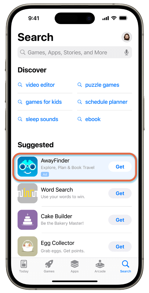
Your ad can be displayed at the top of the Suggested section on the Search tab, capturing a user’s attention before they ever enter a search query. This prime placement speaks to users who are actively looking to discover new apps. An ad also appears at the top of results when someone searches for specific keywords or apps in the search field. These ads are highly visible to those actively seeking specific content.
Search Tab
Engage users right at the onset of their app discovery journey by placing your ad prominently at the top of the suggested apps list, capturing their attention even before they initiate a specific search query.

Search tab ads are displayed at the top of the Suggested section on the Search tab, capturing users’ attention before they begin their search. This ensures that your app is visible to users actively looking to explore new apps.
This placement is particularly effective for increasing brand awareness and app discovery. The prime location makes these ads highly attention-grabbing. Users who see an ad for your new game here are often in the early stages of their search, open to new recommendations.
Search Tab ads use assets from the app’s product page, featuring the app name, icon, and subtitle. This setup is ideal for driving awareness and downloads by catching the attention of users just before they embark on their intended search.
Who: Marketers targeting users starting out on their app discovery journey
What: Ads immediately appearing on the Search tab in the App Store
When: As users open the App Store, before they enter a specific search query
Where: At the top of the Suggested section on the Search tab
Why: To capture user attention early, increasing brand awareness and app discovery
How: Uses assets from the app’s product page, featuring app name, icon, and subtitle
Search Results
Target users with precision by displaying your ad at the top of search results when they enter specific keywords. This placement leverages direct user intent, ensuring that your app is seen by those actively seeking related content.
Search results ads are highly effective for targeting users who are actively searching for an app just like yours. This choice real estate is where most people expect ads to appear. This placement, based on specific keywords or app searches, is designed to reach users who are actively seeking specific content, leveraging a direct signal of user intent. When potential customers search for an app or browse categories by entering specific app names or keywords into the search field, ads are displayed at the very top of the search results page, making them nearly impossible to miss.
Search results ads either consist of a default ad derived from the app’s product page or are created from ad variations via custom product pages. Their effectiveness is enhanced by the ability to match user search terms directly, ensuring high visibility and relevance—turning up exactly where your potential customer is looking. Users are already interested in exactly this kind of content, significantly increasing the likelihood of engagement and potentially resulting in a high conversion rate.
Dominating the Search Results Page
You’ve got your eye on the prize—showing up at the top of search results for your target keywords. Because Search is the way most people find and download apps on the App Store, getting your app to the top of search results is a priority. But how exactly can you secure one of these coveted spots with Apple Search Ads? Let’s break it down.

Bid Smart, Bid Often
The name of the game is bidding strategically on high-value keywords. But don’t just throw money around willy-nilly. Use Apple’s handy tools to research trends, analyze the competition, and set a max bid that aligns with your ROI goals.
Tweak and refine your bids constantly based on performance data. It’s an art and a science, but master it and those top ad positions could be yours.
Nail Your Ad Creatives
A stellar search ad has two key ingredients: an engaging, benefit-focused title and a crystal clear call-to-action. Think of it as a little elevator pitch for your app.
You’ve got to make those 30-ish characters for the title pop. And the description text (don’t sleep on metadata!) needs to seal the deal by spelling out exactly why someone should download your app over all the others.
Optimize Your Metadata
The key to driving traffic starts with optimizing your product page’s metadata. This includes the title, subtitle, description, and keywords. Craft a clear, keyword-rich title that grabs attention and describes your product. The subtitle and description should expand on the key details in an engaging way.
Use relevant keywords naturally throughout the metadata. But don’t overstuff—focus on terms your audience actually searches for. Tools like Google’s Keyword Planner can help identify high-volume, relevant keywords.
Make Your Visuals Pop
Visuals are everything on the App Store. Invest in professional, high-quality screenshots and app preview videos that show your app’s core features and interface. Highlight what makes your product unique and appealing.
Don’t forget to optimize image names, alt text, and video descriptions with your target keywords too. This helps improve search results discoverability.
Who: Marketers targeting users actively searching for apps
What: Ads that appear at the top of relevant search results in the App Store
When: When users search for specific keywords or apps
Where: At the top of the search results page
Why: To target users with a clear intent to find the right new app, ensuring high visibility and relevance
How: Default ad based on the app’s product page or ad variations created from custom product pages
Today Tab: Prime Real Estate for App Discovery
Maximize visibility by positioning your ad on the front page of the App Store, where users commence their exploration. This prime real estate ensures that your app is one of the first things users see, enhancing brand awareness and engagement.

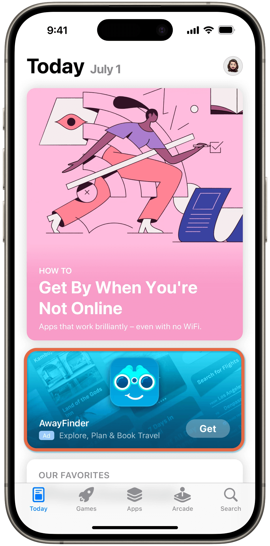
Imagine your sharp new game app showcased as the first thing millions of users see when they open the App Store. This is the power and reach of a Today tab ad—the most premium of the ad placement types, maximizing visibility by positioning your app on the front page of the App Store. According to Apple, half a billion visitors per week start their app-discovery journey here.
The Today tab showcases a selection of app recommendations, editorial content, and featured apps right where users enter the store. These potential customers often arrive in a receptive discovery mindset, actively seeking new and interesting apps and open to relevant recommendations. Atop this curated content is an ideal spot for driving brand awareness and engagement, particularly effective for promoting new content launches, special events, and seasonal promotions.
Crafting Your Today Tab Ad
Creating a Today Tab ad involves a somewhat more elaborate process than the other placement types. First, you need to set up a custom product page in App Store Connect. This serves as the tap destination for your ad and includes assets such as your app name, icon, and subtitle. These animate in the background of your ad, displaying in a color from your app icon, making the ad visually appealing and consistent with your branding.
Once your custom product page is approved in App Store Connect, you can select it when creating your campaign in Apple Search Ads Advanced.
Note that the latest Today Tab ad format runs on iPhone devices using iOS 17.1 and later, while the previously available format runs on iPhones using iOS 16.4 to iOS 17.0. Today Tab ads are not available on iOS 16.3 or earlier, or at all on iPad.
Ensuring Compliance and Approval
After your campaign is created, your ad is automatically submitted for approval. Apple Search Ads reviews your app icon, name, subtitle, and custom product page assets to ensure that they adhere to the Today tab ad guidelines.
Your assets must comply with Apple’s advertising policies that prohibit violent, offensive, sexually explicit, or otherwise inappropriate content. Additionally, no pricing, offers, ranking, or other incentivized promotions are allowed. Lastly, the custom product page must be localized in the default language of the country or region where your campaign will run.
Managing and Monitoring Your Ad
Once your ad is live, you can manage it through the Ads dashboard within your Today Tab ad group. Here, you can monitor current and historical performance data, edit ad names, change ad status, and download reasons for ad rejection. Ad statuses such as Active, Paused, Ad in review, Custom product page incompatible, or Ad content rejected inform you of the current state of your ad.
If issues arise, such as custom product pages not appearing or ads being rejected, it is essential to review and take corrective action. Common issues include missing assets for certain device sizes, incompatibility with the ad group’s country or region, and non-compliance with Apple’s advertising policies. If the issue is with your custom product page assets, you’ll need to revise the screenshots or app previews in your custom product page.
Maximizing the Impact
By following these steps and ensuring compliance with Apple’s guidelines, your ad can be featured on the Today Tab, capturing the attention of users ready to discover and engage with new apps. Leveraging the Today Tab can significantly boost your app’s visibility, drive user engagement, and ultimately lead to higher download rates and better user acquisition metrics.
Who: Marketers aiming to drive significant attention to their app
What: Ads displayed on the front page of the App Store
When: When users first arrive at the App Store
Where: On the Today tab, prominently visible as users start their visit
Why: To increase brand awareness and engagement, especially for new content launches, special events, and seasonal promotions
How: Features the app name, icon, subtitle, and uses a custom product page as the tap destination; assets from the custom page animate in the background
App Product Pages
Leverage the interest of engaged users, inviting them to explore similar apps—i.e., yours—by placing your ad on the product pages of related apps. This strategic placement attracts potential customers already intrigued by an app’s topic or genre, increasing the likelihood of downloads.
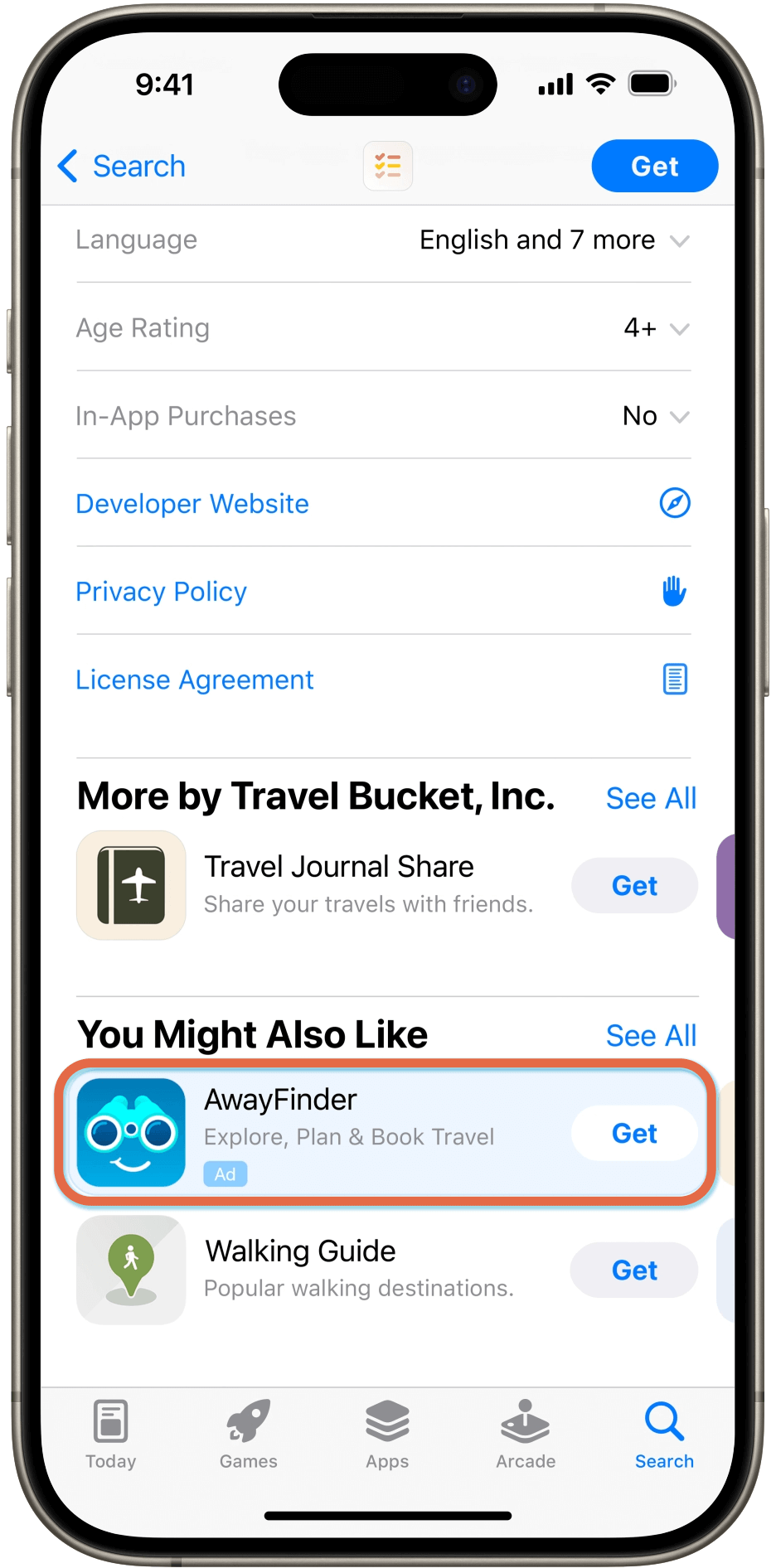
You can bid to have ads for your app displayed on the product pages of other apps, targeting users who are already engaged with similar content. The strategic product pages ad placement is highly effective for reaching users potentially interested in downloading a complementary app, thereby increasing the chances of conversion. While users are checking out details for an app they’ve found in the App Store—or even arrive via an outside link—a related ad appears at the top of You Might Also Like. This gives you a chance to present your game to an already-engaged audience who has shown interest in the particular category.
The key to success with product page ads is ensuring that your ad creative and metadata closely align with the apps and categories you’re targeting. Relevance is the name of the game for this placement. By capturing the interest of already-engaged users and inviting them to explore similar apps—such as yours—you increase the likelihood of downloads from high-interest users. This placement can increase brand awareness and discovery among users browsing the App Store while offering high relevance to user interests, making it a great option for cross-promotion and reaching a receptive audience likely more inclined to convert.
Who: Marketers targeting users already engaged with similar content
What: Ads displayed on the product pages of other apps
When: When users are actively researching and browsing apps
Where: At the top of the You Might Also Like list on other apps’ product pages
Why: To increase brand awareness and discovery among users likely to be interested in complementary apps
How: Uses assets from the app’s product page, featuring the app name, icon, and subtitle


Use Automation to Optimize Your Apple Search Ads Placements
Each ASA ad placement is designed to target users at different stages of their App Store journey, from initial discovery to active searching and browsing. The Search and Today tab placements are particularly effective for capturing broad user attention and driving initial awareness. Search results ads are highly effective for converting users with specific search intents. Product pages ads provide a strategic opportunity to reach users already engaged with similar content, enhancing the chances of app downloads. Advertisers can optimize campaigns by bidding on placements most in line with their objectives and target audience.
Are you feeling overwhelmed managing your campaigns across all of the different Apple Search Ads ad placements? Contact us for an expert consultation and ask how Automation Studio in Search Ads Maven can help you save time and maximize your spend efficiency.
For best practices for Apple Search Ads, check out our blog Apple Search Ads Optimization: 5 Smart Tips for Better Performance.

